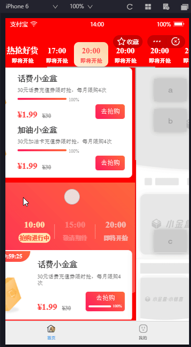
如图,项目迭代中需求开发一个tab页,可以左右滑动切换,全屏,上面tab可点击切换,横向超过一屏时,选中项要自动居中;内部嵌套一个分组商品组件,同样滑动切换,高度自适应(异步),下拉时要吸顶,小球要有动画效果。
支付宝小程序提供的tab组件不满足需求,自己实现功能后,对其中公共部分抽出一个tab组件来重构。
结构分析
- 组件包含navs和contents两部分。
- navs使用view即可。但是要实现点击时自动定位,改为使用scroll-view实现,配合其scroll-into-view属性来定位。
- contents部分要实现左右滑动切换,可以用swiper包裹。内部用scroll-view包裹,控制高度。
组件嵌套
我们可以看到支付宝自带的tab组件使用时,tab组件内部可传入tab-content组件。这里由于上方tab导航项可定制,实际需要传入tab-nav和tab-content两部分。
- vue有provide/inject方法,可以将在子组件中获取父组件,直接在父组件写入子组件的传值。然后所有数据放在父组件计算,这样是最好的。但是小程序不支持。
- 支付宝小程序的tab组件采取的是slot嵌套。使用时,传递的多个tab-content组件整体作为一个slot传入。tab-content组件内部实现为swiper-item包装。
1
2
3
4
5
6
7
8
9
10
11
|
<swiper
circular="{{false}}"
current="{{activeTab}}"
interval="99999999"
autoplay="{{autoplay}}"
duration="{{duration}}"
onChange="handleSwiperChange"
class="am-tabs-content-wrap {{util.compareVersion(version) < 0 ? 'fix' : ''}}">
<slot></slot>
</swiper>
|
1
2
3
4
5
6
7
|
<swiper-item a:if="{{style}}" style="{{style}}" class="am-tabs-pane-wrap" key="tabs-pane-{{key}}">
<slot></slot>
</swiper-item>
<view a:else style="{{tabId !== '' && activeTab !== '' ? tabId === activeTab?'':'height: 0px;' : ''}}" class="am-tabs-pane-wrap" key="tabs-pane-{{key}}">
<slot></slot>
</view>
|
- 我们这里要在不同位置传递多种组件,直接用slot不行,但是可以用具名slot来实现。并且我们要对遍历项进行一些封装,可以生成更多的slot来实现,将包装内容直接写在tab组件中。
1
2
3
4
5
6
7
8
9
10
11
12
13
14
15
16
17
18
19
20
21
22
23
| <view>
<view class="tab-navs">
<scroll-view class="tab-navs-scroll-view" scroll-x>
<view class="tab-item" a:for="{{tabs}}" a:key="{{index}}">
<slot name="tab-{{index}}"></slot>
</view>
<slot name="tab-active"></slot>
</scroll-view>
</view>
<view class="tab-contents">
<swiper>
<swiper-item a:for="{{tabs}}" a:key="{{index}}">
<scroll-view>
<slot name="content-{{index}}"></slot>
</scroll-view>
</swiper-item>
</swiper>
</view>
</view>
|
功能实现
1. 导航对齐方式判断
对组件设置flex属性,对齐方式判断情况分别为space-around和flex-start。开始采用数量判断,但是nav宽度不固定,改用createSelectorQuery判断内部滚动层宽度和外部容器宽度,比较是否超出。
2. 自动高度
contents高度既要能够自适应,又要能够固定高度内部滚动。固定高度内部滚动显然可以用scroll-view来实现。自适应的话,动态修改其height值就可以了。这里有个注意点,swiper的高度没写死的话,是随第一个swiper-item来的,所以传递高度一定要也传给swiper-item。
3. 小球动画实现
小球动画要动态获取选中tab到左边的距离。对于固定宽度的tab,计算即可。低于宽度不固定的tab,只能用createSelectorQuery获取wxml节点了,这里要注意获取到的left值要加上navs的scrollLeft值。这部分出于性能考虑,放到组件外部计算。组件仅传递navs的onScroll事件供外部获取scrollLeft。
4. 选中项位置控制
在组件中通过id和scroll-into-view来控制选中项自动定位到中间。同时由于滚动可导致scrollLeft的变化,应该控制onScroll的获取和小球位置的计算进行延时计算。
5. 吸顶效果实现
对于吸顶,使用createIntersectionObserver实现即可。但是我们并不知道吸顶的高度,并且不是每一个tab组件都需要吸顶,故放在外部来实现。
6. 自动高度切换时闪动问题
自动切换时,如果组件内容是异步加载,可能造成高度闪动。在数据加载完成之前,可以用flag判断,高度传值写成{{loading ? ‘100vh’ : height}}。这样,就可以避免切换过程中闪动。当然,如果加载完实际高度还是很矮就没办法了。
性能优化
- 内容swiper项根据索引判断渲染,只渲染当前索引及前后组件,其余项渲染为一个空的swiper-item。另外这里由于tab页的每一项是之前的页面,出于控制页面生命周期执行考虑,在外部控制仅渲染当前页,前后页渲染为骨架屏。
- 对选中项的动画,将绝对定位改为transform,减少重绘。
- 对nav滚动的scoll计算用debounce
- 吸顶用createIntersectionObserver而非页面的onScroll
最终代码
1
2
3
4
5
6
7
8
9
10
11
12
13
14
15
16
17
18
19
20
21
22
23
24
25
26
27
28
29
30
31
32
33
34
35
36
37
38
39
40
41
42
43
44
45
| <view class='my-tabs-wrapper {{innerClass}} my-tabs-wrapper-{{$id}}' style="{{style}}">
<view class="tab-navs {{innerTabsClass}}">
<view class="tab-navs-inner" style="{{tabsStyle}}">
<scroll-view class="tab-navs-scroll-view" scroll-x trap-scroll catchTouchMove scroll-into-view="{{toView}}" scroll-left="{{tabScrollLeft}}" onScroll="onTabScroll" style="box-sizing: border-box; padding-left: {{leftPadding}}rpx; padding-right: {{rightPadding}}rpx;">
<view class="tab-navs-scroll-inner {{tabsJustifyCenter ? 'center': ''}}">
<view class="tab-item {{index === curTabIndex? 'active' : ''}}" a:for="{{tabs}}" a:key="{{index}}" data-index="{{index}}" data-item="{{item}}" onTap="handleSelectTab" id="{{$id}}-{{index}}">
<slot name="tab-{{index}}"></slot>
</view>
<slot name="tab-active"></slot>
</view>
</scroll-view>
</view>
</view>
<view class="tab-contents {{innerContentsClass}}">
<swiper
class="tab-contents-swiper"
style="height: {{contentHeight}}"
current="{{curTabIndex}}"
autoplay="{{false}}"
vertical="{{false}}"
circular="{{false}}"
onChange="onSwiperChange"
>
<swiper-item class="tab-contents-swiper-item" a:for="{{tabs}}" a:key="{{index}}" style="height: {{contentHeight}}">
<scroll-view
a:if="{{index > curTabIndex - 2 && index < curTabIndex + 2}}"
class="tab-contents-swiper-item-scroll-view"
scroll-y
style="height: {{contentHeight}}"
onScrollToUpper="onContentScrollToUpper"
onScrollToLower="onContentScrollToLower"
>
<view class="tab-contents-swiper-item-inner">
<slot name="content-{{index}}"></slot>
</view>
</scroll-view>
</swiper-item>
</swiper>
</view>
</view>
|
1
2
3
4
5
6
7
8
9
10
11
12
13
14
15
16
17
18
19
20
21
22
23
24
25
26
27
28
29
30
31
32
33
34
35
36
37
38
39
40
41
42
43
44
45
46
47
48
49
50
51
52
53
54
55
56
57
58
59
60
61
62
63
64
65
66
67
68
69
70
71
72
73
74
75
76
77
78
79
80
81
82
83
84
85
86
87
88
89
90
91
92
93
94
95
96
97
98
99
100
101
102
103
104
105
106
107
108
109
110
111
112
113
114
115
116
117
118
119
120
121
122
123
124
| import {
} from '../../utils/util'
Component({
props: {
innerClass: 'tab-navs',
innerTabsClass: 'tab-navs',
innerContentsClass: 'tab-contents',
style: '',
tabsStyle: '',
tabs: [],
tabsJustifyCenter: false,
current: 0,
tabScrollLeft: 0,
contentHeight: '100%',
toViewOffset: 2,
leftPadding: 0,
rightPadding: 0,
onTabScroll: null,
onChange: () => {},
onScrollToUpper: null,
onScrollToLower: null,
},
data: {
$id: '',
curTabIndex: 0,
toView: '',
scrollLeft: 0,
},
didMount () {
if (!this.$page) return false
this.setData({
$id: this.$id,
})
this.setData({
curTabIndex: this.props.current,
})
this.setTabIndex(this.props.current)
this.checkTabsJustify()
},
didUpdate (preProps) {
if (!this.$page) return false
if (this.props.current !== this.data.curTabIndex) {
this.setData({
curTabIndex: this.props.current,
})
this.setTabIndex(this.props.current)
}
},
methods: {
checkTabsJustify () {
if (!this.$page) return false
const self = this
return new Promise((resolve, reject) => {
if (this.props.tabs.length < 2) {
resolve()
} else if (this.$page && my.canIUse('createSelectorQuery')) {
const query = my.createSelectorQuery()
query
.select(`.my-tabs-wrapper-${self.$id} .tab-navs`)
.boundingClientRect()
.select(`.my-tabs-wrapper-${self.$id} .tab-navs-scroll-inner`)
.boundingClientRect()
.exec(res => {
const [wrapper, inner] = res
if (inner && wrapper && inner.width < wrapper.width) {
this.setData({
tabsJustifyCenter: true,
}, resolve)
} else {
resolve()
}
})
} else {
resolve()
}
})
},
onTabScroll (e) {
if (!this.$page) return false
if (this.props.onTabScroll) {
this.props.onTabScroll(e)
}
},
handleSelectTab (e) {
if (!this.$page) return false
const { index } = e.currentTarget.dataset
this.setTabIndex(index)
},
setTabIndex (index) {
if (!this.$page) return false
this.props.onChange(index)
const self = this
const { toViewOffset } = this.props
self.setData({
curTabIndex: index,
toView: `${this.$id}-${index - toViewOffset}`
})
},
onSwiperChange (e) {
if (!this.$page) return false
const { current } = e.detail
this.setTabIndex(current)
},
onContentScrollToUpper (e) {
if (this.props.onScrollToUpper) {
this.props.onScrollToUpper(e)
}
},
onContentScrollToLower (e) {
if (this.props.onScrollToLower) {
this.props.onScrollToLower(e)
}
},
}
})
|
1
2
3
4
5
6
7
8
9
10
11
12
13
14
15
16
17
18
19
20
21
22
23
24
25
26
27
28
29
30
31
32
33
34
35
36
37
38
39
40
41
42
43
44
45
46
47
48
49
50
51
52
53
54
55
56
57
58
59
60
61
62
63
64
| .my-tabs-wrapper {
width: 100%;
height: 100%;
display: flex;
flex-direction: column;
box-sizing: border-box;
.tab-navs{
flex: 0 0 auto;
width: 100%;
position: relative;
z-index: 1000;
min-height: 1px;
.tab-navs-inner{
position: relative;
width: 100%;
overflow-x: auto;
overflow-y: hidden;
z-index: 1000;
box-sizing: border-box;
}
.tab-navs-scroll-view{
width: 100%;
.tab-navs-scroll-inner{
width: min-content;
display: flex;
flex-wrap: nowrap;
align-items: center;
justify-content: flex-start;
position: relative;
&.center{
width: 100%;
justify-content: space-around;
}
.tab-item{}
}
}
}
.tab-contents{
flex: 1;
width: 100%;
height: 100%;
overflow: hidden;
.tab-contents-swiper{
width: 100%;
height: 100%;
}
.tab-contents-swiper-item{
width: 100%;
height: 100%;
}
.tab-contents-swiper-item-scroll-view{
width: 100%;
height: 100%;
}
.tab-contents-swiper-item-inner{
width: 100%;
height: 100%;
}
}
}
|
1
2
3
4
5
| {
"component": true,
"usingComponents": {}
}
|